Sunday, 29 March 2015

Easter Colours at AAA!


It's time for another fun AAA Cards this week.... this week we are challenging you with making a card with Easter colours. 

Don't you love the pretty pastel colours of the Easter candy in the picture? I did and that is where I took the inspiration for my card:


I started with the MFT Floral Fusion Cover Up die - I cut it from Neenah Solar White cardstock. I then took a standard card made from the same card stock and masked an area that corresponded to the inside of the Floral Fusion frame. I sponged on some of my pastel Distress Inks: Squeezed Lemonade, Spun Sugar, Tumbled Glass, Milled Lavender, and Dried Marigold followed by spritzing the whole thing with some Tsukineko Shimmer Spray. It gives the whole panel a nice shimmer - that unfortunately does not show up in the photo.

Because I don't generally give Easter cards, I made it into a Birthday card by adding a a Clearly Besotted word die cut. I did layer a strip of vellum in between the greeting and the card to stop it from getting lost in the background.

I will link this card up to the following challenges:

Now it's your turn to join in the AAA fun here....

Thanks so much for stopping by!!!
Jill

Tuesday, 17 March 2015

Sunbursts!


I have to confess that I am a Clearly Besotted superfan - and I am really loving their latest release - especially the Sunburst stamp set. I immediately saw endless possibilities with these stamps but I started with just a few cards.

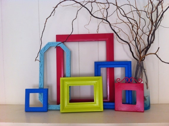
For the first card, I took my inspiration from the current TIME OUT Challenge - it is their first anniversary and a picture challenge (my favourite!) so I just had to play along. Here is their picture:


Frame Collage Funky Bright Home Decor Upcycled Vintage Frames Hollywood Regency Apartment Decor Quirky Decor

And here is my "Happy Birthday TIME OUT" card:


I stamped the sunbursts in different shades of Pigment Ink onto a panel die cut using a MFT die. I stamped the sentiment onto a piece of vellum and heat embossed it with some Black Sparkle powder. Finally, I adhered the panel using some foam tape to the card base and I added a few clear sequins to finish it off.

I also wanted to participate in the latest Virginia's View challenge that focuses on embossing so I decided to do another version of the same card:


This card is (almost) exactly the same as the first card but this time, I coated the pigment ink with some Silver Pearl embossing powder and heat set it. The result is that the colours became less vibrant and much more metallic. I thought that a silver greeting would work better on this card so I used some Detail Silver powder for that.

Here is a side by side of the two cards to show the differences:


Finally, I wanted to make a card featuring the sunbursts as fireworks using bright coloured embossing powder, Here it is:


I like the shape of the fireworks but I'm not so sure about the colours I chose... The city is a Memory Box die cut coated in Versamark and heat embossed using some Stampendous marcasite powder.

I will link up with a few challenges:

Thanks so much for stopping by!
Jill

Sunday, 15 March 2015

Elephants

Yay! It's time for another challenge over at AAA Cards - this week the theme is Bare Naked - we are looking for one layer cards. The design team has created some amazing creations (as usual!) so please check them out - you can get to the challenge by clicking on the game image below:


I took my inspiration for the card from two places: the baby in photo and the fact that I needed to make a card for my co-worker and his wife who just delivered their very first baby boy. Here it is:


It is a very simple card with the baby elephant stamped three times - the stamp itself is a really old one from Fiskars. I then coloured the elephants with Copics - this is still fairly new to me so I kept it to two shades per elephant and then I outlined them in W1 to create some dimension. The sentiment is from the Clearly Besotted Sentimental Type - with the hashtags added in by yours truly. When it was done, I decided that it was a little bit too plain so I added some Wink of Stella to the elephants.

I will also link this card to the current Less Is More Challenge that is also about one layer cards featuring animals.

A while back, I promised to share a few of my holiday pics from Tanzania, and today seemed like a perfect opportunity to share a couple of elephant pics. I saw a lot of elephants while I was there - we got quite close to some of them when we were in our safari jeep, and we even had a couple walk into camp one evening to drink water from the open top water reservoir!!! Apparently, this is quite a regular occurrence but it was very impressive to see them so close. 

The first picture shows a baby elephant with its mother and another member of the troop. It was so cute - our guide estimated it to be no more than a few months old.


The next two pictures show two elephants that are locking their tusks and wrapping their trunks around each other. At first, I thought they were fighting but then the guide explained that it was a friendship greeting - it went on for about five minutes but I could have watched them forever - it was so beautiful and one of my favourite moments from the safari (trust me - the pictures don't do it justice!). The interaction between the two elephants (one obviously much bigger) walking off together to join the rest of the troop who were moving on to greener pastures.


A final (albeit very sad) thought on elephants... one of the things that I learned when I was in Tanzania is that an elephant is killed every 15 minutes for its ivory by poachers. I was shocked because I thought that the world had become more aware of this issue and that ivory trade had been stopped - apparently it was just moved underground to the black market. I don't know what I can do to help this other than to encourage people to travel to Africa to see these wonderful animals so that people can understand that through tourism there is more benefit to keeping them alive than killing them.

Thanks so much for stopping by!!!
Jill
Monday, 2 March 2015

Time For Wine

This weekend, I finally found the time (no pun intended!) to play along with the current TIME OUT Challenge - Rock Around The Clock. I wanted to build the card around the Unity Stamp sentiment "there's always time for a glass of wine" and I decided to make an interactive clock card. Here it is:


I won't go into the details of how I made the clock but I will say that it involved a protractor, and eighth grade geometry (if you want the specifics - please email me - I'm happy to share but it is quite long). I stamped the twelve individual wine glasses in Versamark and heat embossed them with Ranger Liquid Platinum. I then stamped the greeting in black, and did some creative masking before sponging on some Aged Mahogany and Fired Brick Distress Inks - this last part required me to pour myself a glass of red wine so that I could get the colours right :) Finally I die cut the clock hands using a MFT die and coated them in Liquid Platinum embossing powder to match the glasses. The hands were attached with a brad so that they can be spun around - and set to whatever time you would like to indulge in a glass of wine!

I will play along with the following challenges:


Thanks for stopping by - I really appreciate the visits!
Cheers!
Jill

Sunday, 1 March 2015

AAA Design Team


I couple of weeks ago, I threw my name into the hat for the AAA Design Team call,  and to my complete delight and surprise, I was asked to join the team.  I am so honoured to be part of this amazing group of card designers. This is the first design team that I have been a part of so I am nervous/excited to embark on this new journey. I also really like the AAA CAS Challenges - great inspiration photos that really get the creative juices flowing.

So onto this week's card -   the theme this week is rain - with a really pretty inspiration photo. 


I love the water drops in the photo, and wanted to use them on the card. Here is what I came up with :


I started out by die cutting a circle from a piece of regular typing paper to use as a mask. I taped it to the front of the card, and then I taped my favourite stencil (Memory Box - Wave) over the mask. I then started my faux-watercolour technique by sponging some Shabby Shutters, Mowed Lawn, Salty Ocean, and Chipped Sapphire Distress inks through the stencil.  I chose these colours because I thought they would look like rain. After I removed the stencil and the mask, I took a small brush and dipped it into some clean water and went over the stencilled design to create a watercolour. Once it was dry, I applied the "water " drops using Glossy Accents.  I also added two  butterflies die cut from vellum for some balance. The greeting is an old one from Cocoa Daisy - I turned it into a get well card by stamping "sorry to hear you're under the weather " (Studio Calico) on the inside.

I will link this card to a couple of challenges:


Now it's your turn to play along with AAA this week....

Thanks so much for stopping by!!!!
Jill

Friday, 27 February 2015

Origami Butterflies

It has been a little bit since my last post but it was because I was in Florida for work since last Sunday. I was quite a shock coming home last night to -25 C!!! That was quite literally a 50 C drop from the temperatures I had been enjoying all week. I do love winter but I think that I am ready for Spring to show up - maybe that's why I have been making so many cards with butterflies lately :)

Today's card was inspired by the challenge over at Inkspirational:


And here's my card:


I was most inspired by the trees in the background but I didn't have any tree stencils that worked with what I had in mind so I pulled out my new Memory Box Scraped Paint stencil. On a piece of SSS Fog cardstock I masked a strip for the sentiment, and then I sponged some SSS Cobblestone ink through it. I then pulled up the stencil, shifted it over slightly and taped it down again. This time I applied some Ranger Texture Paste that I had coloured with SSS Fog ink. I was hoping to create a shadow effect - but I think it came out more as a blurred lines effect... Here is a close up of that effect:


I also liked the Japanese feel of the inspiration photo so I immediately thought of origami... and the tranquil feel of the photo - butterflies - so origami butterflies is where I went. For the butterflies, I stamped the Altenew Ori Kami butterflies on several pieces of patterned paper and then fussy cut, and paper pieced them. I coated them in Wink of Stella and added some gems to finish them off. The sentiment is also from the Ori Kami set.

I will link this card to the following challenges:

Thanks so much for stopping by!!!
Jill

Saturday, 21 February 2015

Butterfly Thanks

I definitely had a love-hate relationship with this card as it finally came together after no less than three attempts. On the first one, the watercolour leaked outside the lines, and then on the second one, I smudged the black ink dots all over. Even this one has a smudge on it but I think that I'll let it go...


The giant butterfly is from Tattered Angels - I have had it around for a long time but this is the first time it has seen any action. I stamped it in black Versamark, and then watercoloured it using Spiced Marmalade and Ripe Persimmon Distress re-inkers. I did use some masking fluid around the butterfly before colouring (key learning card#1), and once it was dry, I covered it (generously!) with some Wink of Stella. I used some Black Soot ink to create the splatters with a small brush. The Hero Arts greeting was stamped on vellum and stitched onto the card using some gold embroidery thread.


Here is a view of the back of the card:


I will link this card up to a few places:


Thanks for stopping by!
Jill